ShopDreamUp AI ArtDreamUp

Deviation Actions
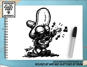
Monthly Strip Subscription (with Xtras!)
😂 Laugh your way through 2024! Motivational Housecat! is back, and it's bringing the comedy gold. Subscribe now for the wittiest, most absurd comic strips in circulation!
$10/month


Suggested Deviants


Suggested Collections


You Might Like…


Description
Page 1 of a 7-page story for IDW Publishing.
This is part of a short-story collection written by Dara Naraghi entitled "LIFELIKE", available this December from IDW.
Pencils, inks, and colors by me.
I am PETRIFIED of coloring, so this took me forever. I'm still working on the other pages, but I THINK they look OK. It's hard to say, as I've been staring at them for HOURS ON END, so my vision is a little skewed...
Strathmore 400-series watercolor paper. Dr Martin's Black Star india ink. Adobe Photoshop CS2. Apple iBook 900.
Page 2
Page 3
Page 4
Image size
592x854px 374.23 KB
© 2007 - 2024 B3NN3TT
Comments22
Join the community to add your comment. Already a deviant? Log In
Woo, I really like the look of these pages too! After seeing this, I see no reason why you should be petrified of color, it looks fantastic! Way better than a lot of the coloring I see going on. I look foreward to seeing more. *goes to check out the already uploaded ones*